Journal
Choosing where to live is probably the biggest decision you’ll make, but real estate sites only show you the price tag. They don’t tell you if you’ll feel safe walking home at night, whether you can actually get to work without sitting in traffic, or if schools nearby are decent.
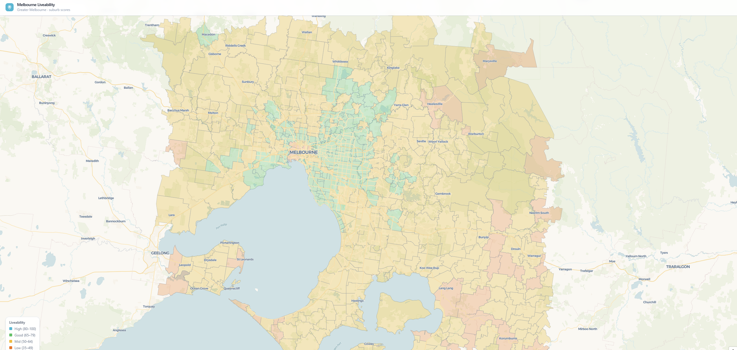
I built this because those trade-offs matter. The index blends five real factors — safety, transport, school quality, green space, and affordability — into a single liveability score for all 673 Melbourne suburbs. It’s not about finding the “best” suburb (there isn’t one). It’s about seeing the actual trade-offs so you can decide what matters to you: Do you want affordability or short commute? Schools or green space? The interactive map lets you explore those choices instead of guessing.
How it works:
The scoring model blends five metrics into a 0–100 liveability score:
- Safety (25%) — Crime rate per 100k population from Victoria Police data
- Transport (25%) — Proximity to train/tram/bus stops + service frequency via PTV GTFS
- Schools (20%) — School quality via ICSEA (Index of Community Socio-Educational Advantage) scores from ACARA
- Green space (15%) — Parks and accessible green areas from OpenStreetMap
- Affordability (15%) — Median property prices (inverted so higher prices = lower affordability score)
Each metric is normalized so they contribute equally despite wildly different original scales — crime rates, school indices, and dollar amounts all live on the same 0–100 scale.
What the data reveals:
Affordability and liveability are inversely correlated, not aligned. Suburbs scoring highest on affordability—Pakenham South, Narre Warren, Dandenong—often rank poorly on transport and schools. This reveals a fundamental trade-off: you rarely get all five dimensions in one suburb. A retiree willing to trade schools for affordability and safety will have completely different liveability optima than a young family commuting to the CBD.
Inner suburbs (Kew, Hawthorn, Viewbank) show strong fundamentals across all metrics but face median prices above $2M. Growth corridors offer the inverse—genuinely affordable but with lower public transport frequency and school quality. Melbourne’s liveability isn’t a single curve; it’s multiple competing priorities. Only 443 of 673 suburbs have complete price data, revealing how real estate information skews toward established, transactional suburbs—rural and emerging areas are invisible to property databases.
The default 25/25/20/15/15 weighting reflects broad consensus but masks individual life-stage priorities. This is why the slider-based reweighting system matters: it’s not about finding the “best” suburb, but letting each person define what liveability means to them.
The interface:
Light, modern UI with a clean white theme. Search any suburb and the map jumps to it. Click any suburb on the map to see its overall score and full breakdown across all five categories. A sidebar shows detailed metrics and comparisons. The 673 suburb polygons are colored dynamically — cyan for highly liveable, red for less so — so patterns across the city jump out visually.
Tech stack:
Python FastAPI backend serves the scoring logic and data queries. Next.js React frontend handles the interactive map and search. PostgreSQL stores suburb boundaries, scores, and all metric data. Spatial rendering is optimized so dragging and clicking across 673 polygons stays smooth.
Real-world use:
Compare neighborhoods before moving. Evaluate suburb potential for property investment. Or just explore what makes some areas of Melbourne more liveable than others. The data is real — Victoria Police crime stats, ACARA school data, PTV transport schedules, OpenStreetMap parks — so the insights are actionable.